
Copperhill
Optimizing Enterprise Data Workflows & Reducing Excel Dependency: Redesigning core filtering logic and establishing Design System 2.0 to decrease external data exports by 40%.
Role:
UX Design Intern
Duration:
June 2025 - August 2025
Tools
Figma
Zeroheight
Jira
Overview
Optimizing B2B Trade Workflows for a Growing Platform
Copperhill is an international trade compliance company based in Livonia, Michigan, building an AI-driven platform to consolidate all trade activities into one interface. As the platform scaled, the data volume exploded but the interface stayed stuck in place.
What clients actually needed: A platform that could handle tens of thousands of classification entries without forcing analysts to export everything to Excel just to do their jobs. They needed speed, flexibility, and the ability to save their work—because in trade compliance, repeating the same 5-minute query setup every morning isn't just annoying, it's a massive productivity killer.
I redesigned the core data visualization modules and built out design system foundations to solve a critical problem: analysts were ditching the platform to work in Excel instead.
Problem
The "Excel Drop-off"
When I joined Copperhill, I wasn't handed a specific project—which meant I had freedom to dig around and find what actually needed fixing. I started sitting in on sessions with the Ops team, just watching how analysts used the platform day-to-day.
That's when I noticed the pattern: users would log in, pull up their data, hit "Export CSV," and immediately bounce to Excel. Every. Single. Time.
So I dug deeper and found two major pain points:
- Filters were too broad - Users couldn't drill down to specific columns (like "Show only Suppliers in Mexico"), so finding one classification code among thousands was brutal
- Nothing saved - Analysts had to rebuild the same complex queries every single morning (5+ minutes wasted) because there was no way to save their preferences
Key outcome? 40% Reduction in CSV Exports post-launch!
Targeted Solution
Engineering Collaboration: The "Resizing" Pivot
I initially designed a drag-and-drop interaction for resizing columns—basically giving users the same freedom they had in Excel. Before I finalized the high-fidelity mocks though, I synced with the front-end team and they flagged that calculating live widths for thousands of entries would tank browser performance and building a custom drag-handle would be way too heavy for the current framework.
How I pivoted:
- I switched to a "View" dropdown with preset buttons (Small, Medium, Large) for both rows and columns
- Users could still resize everything at once or tweak individual columns to fit their screen
- The solution ended up being way faster to code and instant to load. We got the data density users needed without breaking anything
Initial
Revised
Key Design Decisions
Contextual Control & Real User Stories
I went back to users to dig into what they actually needed day-to-day and designed solutions that fit into their existing workflow.
Decision A: Column-Level Filtering
- I moved filtering out of some hidden settings page and stuck it right in the table headers where people were already looking
- This cut down on clicks and matched how people already think about working with data in Excel
- The impact: Analysts could finally filter by specific columns (like "Show only Mexico suppliers" or "HS codes starting with 8471") without touching global filters that messed up their entire view
Initial
Filters


Include All Statuses

Show only reopened workload
Show only expired workload

HTS


|

Operator
*
Value
*
contains
does not contain
is not equal to
is equal to
blank/not blank
length
starts with

Add filter
Cancel
Apply
Revised
Filters
Filter Condition 1

HTS

contains
8357
Operator
*
Value
*
Category
*
Add filter
Cancel
Apply
Decision B: "Saved Views"
- I added a way for analysts to save their filter setups so they could pull them up in one click instead of rebuilding queries every morning
- I also threw in filter history so people had full control and could undo mistakes without panicking
- The impact: That daily 5-minute setup ritual? Gone. Analysts could start their workday actually working instead of configuring the same view they used yesterday
Initial
Revised
Reset

0 of 4 selected

Filter
2

Sort
1

View

Show
Reset all (3)
View history
Cancel
Apply
The Outcome: After launch, we saw a 40% drop in CSV exports—people were actually staying in the platform instead of bailing to Excel. That was the metric that mattered because it meant they were finally using the AI insights Copperhill was built to provide.
Initiated Proposal
Enhancing the Foundation: Design System 2.0
Halfway through the project I realized the real issue wasn't just messy files, it was that non-designers had no clue how to actually use our design system. Developers and PMs were struggling because the documentation was static and didn't explain the reasoning behind anything, so by the time they checked it, the designs had already changed.
What I did:
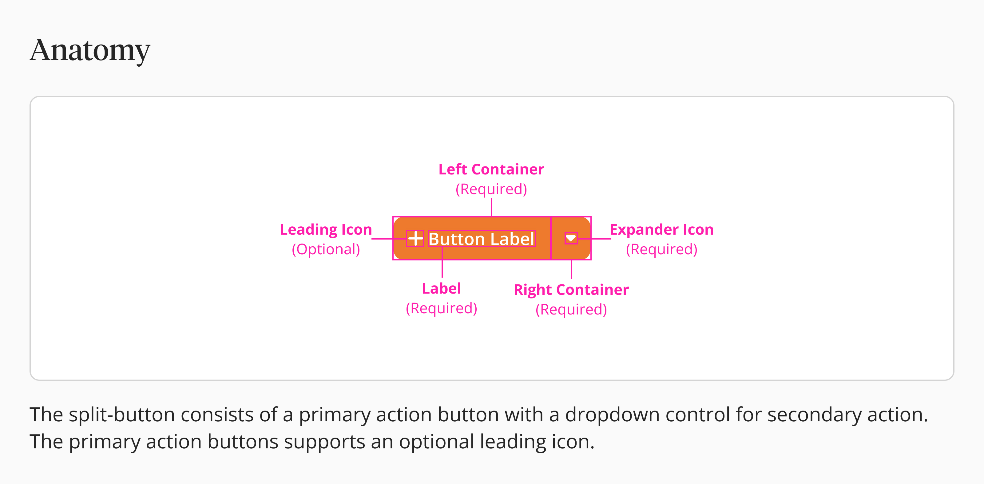
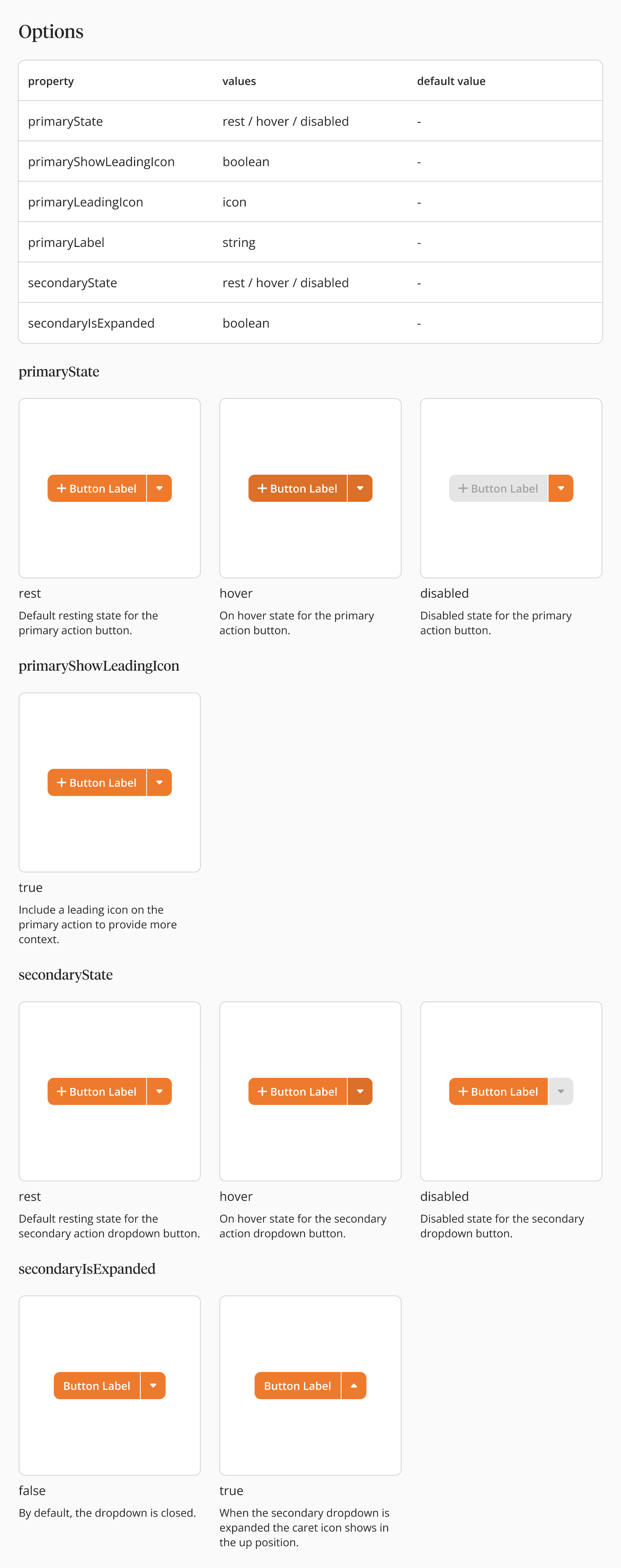
- Moved us to Zeroheight - I built out clear tables breaking down component anatomy and properties (like what "PrimaryState" or "LeadingIcon" actually means) so non-designers could understand the logic, not just copy-paste visuals
- Switched to live Figma embeds - Got rid of static screenshots so any update I made auto-synced to the developer specs—basically created one source of truth that stayed current
The Impact:
- 30% fewer support tickets - Devs stopped asking clarifying questions because the docs already answered them
- Builds matched designs - The final product actually looked like the mockups because everyone had clear guardrails to follow
Additional Feature Contributions
Beyond the Big Projects
Here's the thing about working at a young company like Copperhill—tackling just one big project wasn't really an option. The platform was growing fast, and there were so many rough edges that needed attention. So beyond the filtering overhaul and design system work, I also jumped into:
- System Notifications - Designed alert patterns so users actually noticed critical trade compliance updates without getting notification fatigue
- Local Login UI - Rebuilt the authentication experience to feel more trustworthy and professional (you can check it out here
- Supplier Details - Restructured how supplier information displays so analysts could quickly verify trade partners without drowning in data
- Configurable ROO (Rules of Origin) - Created flexible templates for compliance documentation that adapted to different country requirements
If you've got time, feel free to poke around those on this page —they show how I think about designing across different parts of a product ecosystem, not just one feature.
Key Takeaways & Reflection
What did I learn?
Between the filtering updates, Design System 2.0, and other features like System Notifications and Local Login, the biggest thing I learned was that shipping good B2B software is all about balancing what users need with what's actually possible to build.
1. Feasibility is a Creative Constraint:
- The resizing pivot taught me to loop in engineers during wireframes, not after I've already designed something I'm attached to
- Working within technical limits actually pushed me to come up with something better—the preset system ended up cleaner than my original drag idea
2. Design Systems are Educational Tools:
- The disconnect between design and dev usually isn't about skill—it's about missing context
- When I documented the "why" behind components, developers could move faster and make smarter decisions on their own
3. Efficiency is the Ultimate B2B Feature:
- In consumer apps, delight might be a fun animation, but in B2B, delight is shaving off a click
- Features like "Saved Views" aren't flashy but they're what actually makes someone's 8-hour workday less miserable
Copperhill
Optimizing Enterprise Data Workflows & Reducing Excel Dependency: Redesigning core filtering logic and establishing Design System 2.0 to decrease external data exports by 40%.
Role:
UX Design Intern
Duration:
June 2025 - August 2025
Tools
Figma
Zeroheight
Jira
Overview
Optimizing B2B Trade Workflows for a Growing Platform
Copperhill is an international trade compliance company based in Livonia, Michigan, building an AI-driven platform to consolidate all trade activities into one interface. As the platform scaled, the data volume exploded but the interface stayed stuck in place.
What clients actually needed: A platform that could handle tens of thousands of classification entries without forcing analysts to export everything to Excel just to do their jobs. They needed speed, flexibility, and the ability to save their work—because in trade compliance, repeating the same 5-minute query setup every morning isn't just annoying, it's a massive productivity killer.
I redesigned the core data visualization modules and built out design system foundations to solve a critical problem: analysts were ditching the platform to work in Excel instead.
Problem
The "Excel Drop-off"
When I joined Copperhill, I wasn't handed a specific project—which meant I had freedom to dig around and find what actually needed fixing. I started sitting in on sessions with the Ops team, just watching how analysts used the platform day-to-day.
That's when I noticed the pattern: users would log in, pull up their data, hit "Export CSV," and immediately bounce to Excel. Every. Single. Time.
So I dug deeper and found two major pain points:
- Filters were too broad - Users couldn't drill down to specific columns (like "Show only Suppliers in Mexico"), so finding one classification code among thousands was brutal
- Nothing saved - Analysts had to rebuild the same complex queries every single morning (5+ minutes wasted) because there was no way to save their preferences
Key outcome? 40% Reduction in CSV Exports post-launch!
Targeted Solution
Engineering Collaboration: The "Resizing" Pivot
I initially designed a drag-and-drop interaction for resizing columns—basically giving users the same freedom they had in Excel. Before I finalized the high-fidelity mocks though, I synced with the front-end team and they flagged that calculating live widths for thousands of entries would tank browser performance and building a custom drag-handle would be way too heavy for the current framework.
How I pivoted:
- I switched to a "View" dropdown with preset buttons (Small, Medium, Large) for both rows and columns
- Users could still resize everything at once or tweak individual columns to fit their screen
- The solution ended up being way faster to code and instant to load. We got the data density users needed without breaking anything
Initial
Revised
Key Design Decisions
Contextual Control & Real User Stories
I went back to users to dig into what they actually needed day-to-day and designed solutions that fit into their existing workflow.
Decision A: Column-Level Filtering
- I moved filtering out of some hidden settings page and stuck it right in the table headers where people were already looking
- This cut down on clicks and matched how people already think about working with data in Excel
- The impact: Analysts could finally filter by specific columns (like "Show only Mexico suppliers" or "HS codes starting with 8471") without touching global filters that messed up their entire view
Initial
Filters
Include All Statuses
Show only reopened workload
Show only expired workload
HTS
|
Operator
*
Value
*
contains
does not contain
is not equal to
is equal to
blank/not blank
length
starts with
Add filter
Cancel
Apply
Revised
Filters
Filter Condition 1
HTS
contains
8357
Operator
*
Value
*
Category
*
Add filter
Cancel
Apply
Decision B: "Saved Views"
- I added a way for analysts to save their filter setups so they could pull them up in one click instead of rebuilding queries every morning
- I also threw in filter history so people had full control and could undo mistakes without panicking
- The impact: That daily 5-minute setup ritual? Gone. Analysts could start their workday actually working instead of configuring the same view they used yesterday
Initial
Revised
Reset
0 of 4 selected
Filter
2
Sort
1
View
Show
Reset all (3)
View history
Cancel
Apply
The Outcome: After launch, we saw a 40% drop in CSV exports—people were actually staying in the platform instead of bailing to Excel. That was the metric that mattered because it meant they were finally using the AI insights Copperhill was built to provide.
Initiated Proposal
Enhancing the Foundation: Design System 2.0
Halfway through the project I realized the real issue wasn't just messy files, it was that non-designers had no clue how to actually use our design system. Developers and PMs were struggling because the documentation was static and didn't explain the reasoning behind anything, so by the time they checked it, the designs had already changed.
What I did:
- Moved us to Zeroheight - I built out clear tables breaking down component anatomy and properties (like what "PrimaryState" or "LeadingIcon" actually means) so non-designers could understand the logic, not just copy-paste visuals
- Switched to live Figma embeds - Got rid of static screenshots so any update I made auto-synced to the developer specs—basically created one source of truth that stayed current
The Impact:
- 30% fewer support tickets - Devs stopped asking clarifying questions because the docs already answered them
- Builds matched designs - The final product actually looked like the mockups because everyone had clear guardrails to follow
Additional Feature Contributions
Beyond the Big Projects
Here's the thing about working at a young company like Copperhill—tackling just one big project wasn't really an option. The platform was growing fast, and there were so many rough edges that needed attention. So beyond the filtering overhaul and design system work, I also jumped into:
- System Notifications - Designed alert patterns so users actually noticed critical trade compliance updates without getting notification fatigue
- Local Login UI - Rebuilt the authentication experience to feel more trustworthy and professional (you can check it out here
- Supplier Details - Restructured how supplier information displays so analysts could quickly verify trade partners without drowning in data
- Configurable ROO (Rules of Origin) - Created flexible templates for compliance documentation that adapted to different country requirements
If you've got time, feel free to poke around those on this page —they show how I think about designing across different parts of a product ecosystem, not just one feature.
Key Takeaways & Reflection
What did I learn?
Between the filtering updates, Design System 2.0, and other features like System Notifications and Local Login, the biggest thing I learned was that shipping good B2B software is all about balancing what users need with what's actually possible to build.
1. Feasibility is a Creative Constraint:
- The resizing pivot taught me to loop in engineers during wireframes, not after I've already designed something I'm attached to
- Working within technical limits actually pushed me to come up with something better—the preset system ended up cleaner than my original drag idea
2. Design Systems are Educational Tools:
- The disconnect between design and dev usually isn't about skill—it's about missing context
- When I documented the "why" behind components, developers could move faster and make smarter decisions on their own
3. Efficiency is the Ultimate B2B Feature:
- In consumer apps, delight might be a fun animation, but in B2B, delight is shaving off a click
- Features like "Saved Views" aren't flashy but they're what actually makes someone's 8-hour workday less miserable
Copperhill
Optimizing Enterprise Data Workflows & Reducing Excel Dependency: Redesigning core filtering logic and establishing Design System 2.0 to decrease external data exports by 40%.
Role:
UX Design Intern
Duration:
June 2025 - August 2025
Tools
Figma
Zeroheight
Jira
Overview
Optimizing B2B Trade Workflows for a Growing Platform
Copperhill is an international trade compliance company based in Livonia, Michigan, building an AI-driven platform to consolidate all trade activities into one interface. As the platform scaled, the data volume exploded but the interface stayed stuck in place.
What clients actually needed: A platform that could handle tens of thousands of classification entries without forcing analysts to export everything to Excel just to do their jobs. They needed speed, flexibility, and the ability to save their work—because in trade compliance, repeating the same 5-minute query setup every morning isn't just annoying, it's a massive productivity killer.
I redesigned the core data visualization modules and built out design system foundations to solve a critical problem: analysts were ditching the platform to work in Excel instead.
Problem
The "Excel Drop-off"
When I joined Copperhill, I wasn't handed a specific project—which meant I had freedom to dig around and find what actually needed fixing. I started sitting in on sessions with the Ops team, just watching how analysts used the platform day-to-day.
That's when I noticed the pattern: users would log in, pull up their data, hit "Export CSV," and immediately bounce to Excel. Every. Single. Time.
So I dug deeper and found two major pain points:
- Filters were too broad - Users couldn't drill down to specific columns (like "Show only Suppliers in Mexico"), so finding one classification code among thousands was brutal
- Nothing saved - Analysts had to rebuild the same complex queries every single morning (5+ minutes wasted) because there was no way to save their preferences
Key outcome? 40% Reduction in CSV Exports post-launch!
Targeted Solution
Engineering Collaboration: The "Resizing" Pivot
I initially designed a drag-and-drop interaction for resizing columns—basically giving users the same freedom they had in Excel. Before I finalized the high-fidelity mocks though, I synced with the front-end team and they flagged that calculating live widths for thousands of entries would tank browser performance and building a custom drag-handle would be way too heavy for the current framework.
How I pivoted:
- I switched to a "View" dropdown with preset buttons (Small, Medium, Large) for both rows and columns
- Users could still resize everything at once or tweak individual columns to fit their screen
- The solution ended up being way faster to code and instant to load. We got the data density users needed without breaking anything
Initial
Revised
Key Design Decisions
Contextual Control & Real User Stories
I went back to users to dig into what they actually needed day-to-day and designed solutions that fit into their existing workflow.
Decision A: Column-Level Filtering
- I moved filtering out of some hidden settings page and stuck it right in the table headers where people were already looking
- This cut down on clicks and matched how people already think about working with data in Excel
- The impact: Analysts could finally filter by specific columns (like "Show only Mexico suppliers" or "HS codes starting with 8471") without touching global filters that messed up their entire view
Initial
Filters
Include All Statuses
Show only reopened workload
Show only expired workload
HTS
|
Operator
*
Value
*
contains
does not contain
is not equal to
is equal to
blank/not blank
length
starts with
Add filter
Cancel
Apply
Revised
Filters
Filter Condition 1
HTS
contains
8357
Operator
*
Value
*
Category
*
Add filter
Cancel
Apply
Decision B: "Saved Views"
- I added a way for analysts to save their filter setups so they could pull them up in one click instead of rebuilding queries every morning
- I also threw in filter history so people had full control and could undo mistakes without panicking
- The impact: That daily 5-minute setup ritual? Gone. Analysts could start their workday actually working instead of configuring the same view they used yesterday
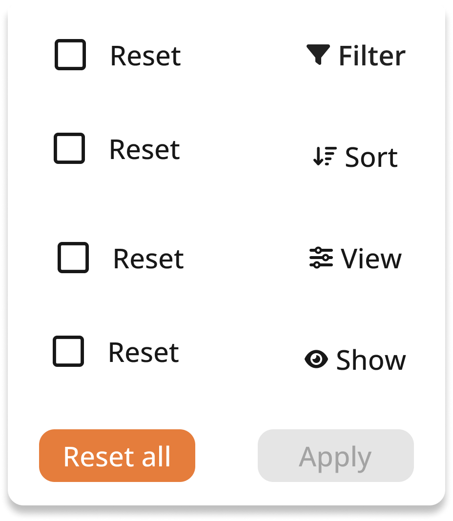
Initial
Reset
Filter
Reset
Sort
Reset
View
Reset
Show
Reset all
Apply
Revised
Reset
0 of 4 selected
Filter
2
Sort
1
View
Show
Reset all (3)
View history
Cancel
Apply
The Outcome: After launch, we saw a 40% drop in CSV exports—people were actually staying in the platform instead of bailing to Excel. That was the metric that mattered because it meant they were finally using the AI insights Copperhill was built to provide.
Initiated Proposal
Enhancing the Foundation: Design System 2.0
Halfway through the project I realized the real issue wasn't just messy files, it was that non-designers had no clue how to actually use our design system. Developers and PMs were struggling because the documentation was static and didn't explain the reasoning behind anything, so by the time they checked it, the designs had already changed.
What I did:
- Moved us to Zeroheight - I built out clear tables breaking down component anatomy and properties (like what "PrimaryState" or "LeadingIcon" actually means) so non-designers could understand the logic, not just copy-paste visuals
- Switched to live Figma embeds - Got rid of static screenshots so any update I made auto-synced to the developer specs—basically created one source of truth that stayed current
The Impact:
- 30% fewer support tickets - Devs stopped asking clarifying questions because the docs already answered them
- Builds matched designs - The final product actually looked like the mockups because everyone had clear guardrails to follow
Additional Feature Contributions
Beyond the Big Projects
Here's the thing about working at a young company like Copperhill—tackling just one big project wasn't really an option. The platform was growing fast, and there were so many rough edges that needed attention. So beyond the filtering overhaul and design system work, I also jumped into:
- System Notifications - Designed alert patterns so users actually noticed critical trade compliance updates without getting notification fatigue
- Local Login UI - Rebuilt the authentication experience to feel more trustworthy and professional (you can check it out here
- Supplier Details - Restructured how supplier information displays so analysts could quickly verify trade partners without drowning in data
- Configurable ROO (Rules of Origin) - Created flexible templates for compliance documentation that adapted to different country requirements
If you've got time, feel free to poke around those on this page —they show how I think about designing across different parts of a product ecosystem, not just one feature.
Key Takeaways & Reflection
What did I learn?
Between the filtering updates, Design System 2.0, and other features like System Notifications and Local Login, the biggest thing I learned was that shipping good B2B software is all about balancing what users need with what's actually possible to build.
1. Feasibility is a Creative Constraint:
- The resizing pivot taught me to loop in engineers during wireframes, not after I've already designed something I'm attached to
- Working within technical limits actually pushed me to come up with something better—the preset system ended up cleaner than my original drag idea
2. Design Systems are Educational Tools:
- The disconnect between design and dev usually isn't about skill—it's about missing context
- When I documented the "why" behind components, developers could move faster and make smarter decisions on their own
3. Efficiency is the Ultimate B2B Feature:
- In consumer apps, delight might be a fun animation, but in B2B, delight is shaving off a click
- Features like "Saved Views" aren't flashy but they're what actually makes someone's 8-hour workday less miserable