
Siemens Energy
A comprehensive design system for Copperhill's B2B SaaS platform, focusing on scalability, accessibility, and developer handoff. This project involved creating a unified component library that streamlines the design-to-development workflow.
Role:
UX Design Intern
Duration:
June 2023 - August 2023
Tools
Figma
Adobe XD
Miro
View ICS Website
Context
How to Represent ICS’s Digital Presence Effectively?
The Siemens Energy Innovation Center in Shenzhen (ICS) is a hub for cutting-edge green technology—think massive wind turbines, compressed air energy storage, and power-to-X systems. But when I joined, the digital presence didn't match that innovation at all. I was brought on to redesign the ICS section of the global website to align it with the main Siemens Energy brand and make dense engineering content actually approachable for partners, government officials, and clients.
Key Outcomes:
- 55% Reduction in Page Length (via Tabs & Accordions)
- 50% Fewer Clicks to Access Technical Specs
- 100% Alignment with Siemens Global Brand Guidelines
Problem
The Initial Website was a Poorly Structured PowerPoint
During my initial audit of the existing site, I identified a critical friction point: the interface felt more like a static PowerPoint deck than a responsive website.
What was broken:
- Cognitive overload - Users hit walls of text and fragmented screens, making it brutal to find specific info quickly
- Navigation fatigue - To view related topics, users had to click through three separate screens, completely disrupting their reading flow
- Visual disconnect - The layout didn't match the polish of the global Siemens Energy brand and used text-heavy dropdowns that buried value instead of showcasing it
My Approach
Organizing Bulk Information
My primary goal was consolidation. I needed to fit massive amounts of technical data into a clean view without deleting important details.
For the "ICS Spotlight" section, I replaced the fragmented page structure with a cohesive tab-based interface.
The impact:
- 60% reduction in total page length by consolidating three screens into one view
- 2x faster content scanning—users could grasp key points without endless scrolling
Initial
Revised
The Outcome: This solution was lightweight to code and instant to load. We solved the user's need for data density without overloading the front end.
Key Design Decisions
Visual Transformation: From Lists to Carousels
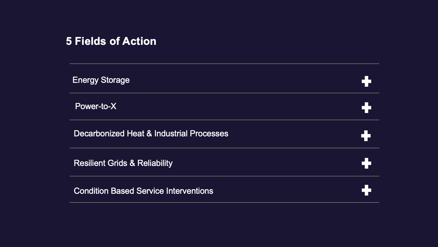
The "Fields of Action" section (covering Energy Storage, Power-to-X, etc.) was originally a dry, clickable text dropdown. It failed to capture the scale of the machinery being discussed.
The Pivot: Visual Storytelling
I transformed the text list into an interactive image carousel.
- Why it mattered: Energy solutions are physical and impressive. A text label doesn't sell a wind turbine—a photo does. The horizontal carousel established a clear visual hierarchy that guided the user's eye and actually showed what ICS builds.
- The result: Early testing showed users spent ~30% more time interacting with the carousel compared to the previous text layout, proving that visual engagement drives retention.
Initial
Revised
Managing Density: The "Hub" Accordion
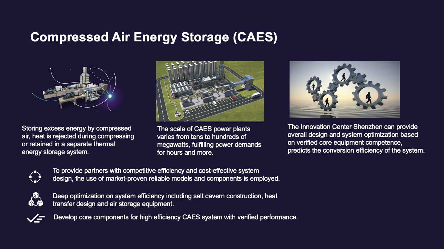
The "New Energy Technology Hub" presented the hardest challenge—I needed to display deep-dive specifications for technologies like Compressed Air Energy Storage (CAES) without overwhelming people.
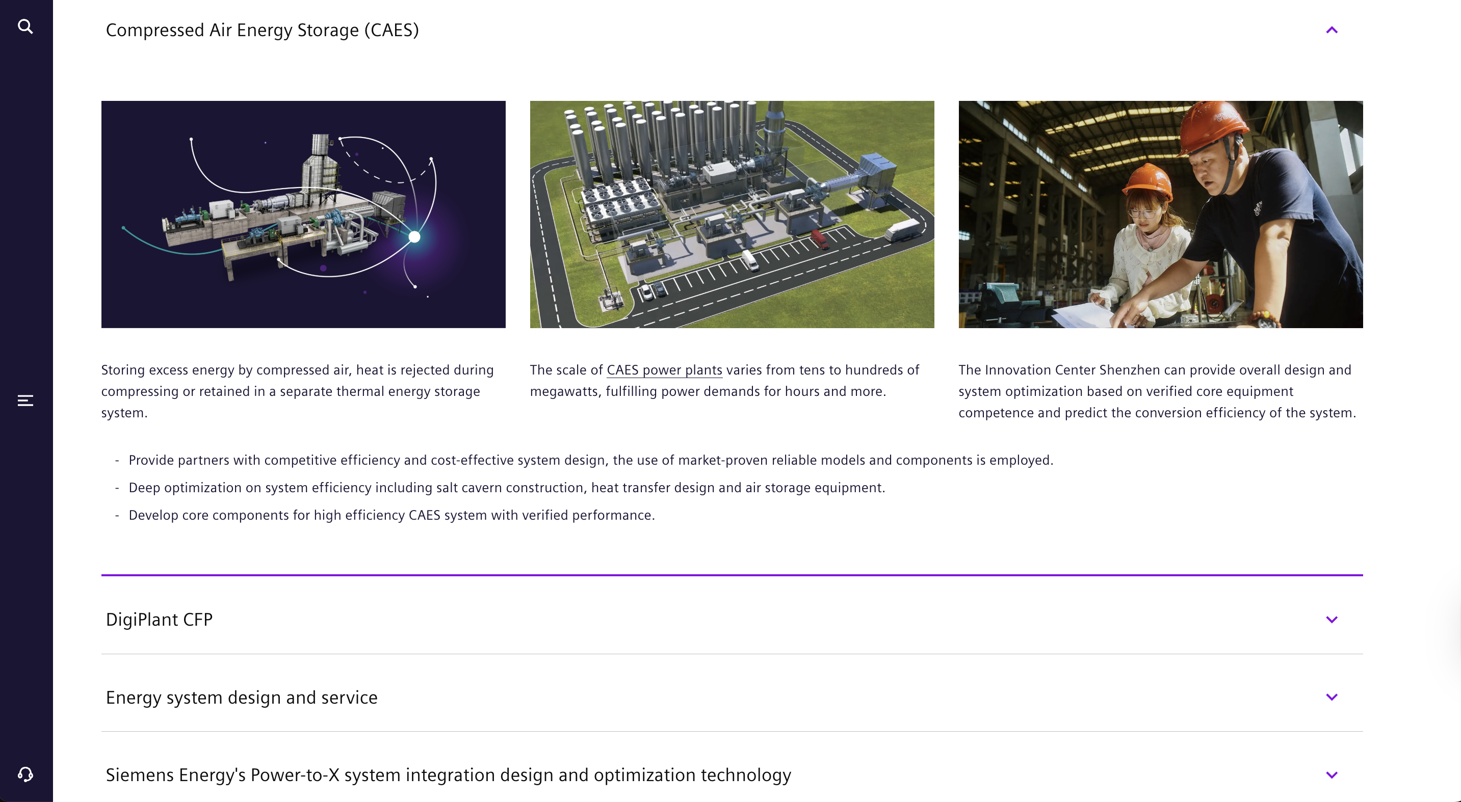
I redesigned scattered screens into a single expandable/collapsible dropdown system.
- The strategy: Instead of hitting users with four screens of data at once, I grouped content by technology type so they had direct control over what they wanted to reveal
- The result: This approach cut page length by ~55% and reduced scrolling effort by 40%, letting users focus on one complex topic at a time without visual noise
Initial
Revised
Key Takeaways & Reflection
Results & Reflection
This internship was a deep dive into Enterprise Information Architecture. I learned that in the B2B space, "clean" design isn't just about white space—it's about structuring data so it can be consumed efficiently.
What I achieved:
- Efficiency - I audited and restructured the content flow, reducing click-depth by ~50% for key information
- Consistency - I brought the rogue microsite back in line with Siemens Energy's global UI guidelines, ensuring a professional and cohesive brand look
- Engagement - By shifting from text lists to interactive components (tabs, carousels, accordions), I transformed a passive reading experience into an active, exploratory one
What I achieved:
Siemens Energy
A comprehensive design system for Copperhill's B2B SaaS platform, focusing on scalability, accessibility, and developer handoff. This project involved creating a unified component library that streamlines the design-to-development workflow.
Role:
UX Design Intern
Duration:
June 2023 - August 2023
Tools
Figma
Adobe XD
Miro
View ICS Website
Context
How Do You Make Green Tech Feel As Innovative As It Actually Is?
The Siemens Energy Innovation Center in Shenzhen (ICS) is a hub for cutting-edge green technology—think massive wind turbines, compressed air energy storage, and power-to-X systems. But when I joined, the digital presence didn't match that innovation at all. I was brought on to redesign the ICS section of the global website to align it with the main Siemens Energy brand and make dense engineering content actually approachable for partners, government officials, and clients.
Key Outcomes:
- 55% Reduction in Page Length (via Tabs & Accordions)
- 50% Fewer Clicks to Access Technical Specs
- 100% Alignment with Siemens Global Brand Guidelines
Problem
The Initial Website was a Poorly Structured PowerPoint
During my initial audit of the existing site, I identified a critical friction point: the interface felt more like a static PowerPoint deck than a responsive website.
My Approach
Organizing Bulk Information
My primary goal was consolidation. I needed to fit massive amounts of technical data into a clean view without deleting important details.
For the "ICS Spotlight" section, I replaced the fragmented page structure with a cohesive tab-based interface.
The impact:
- 60% reduction in total page length by consolidating three screens into one view
- 2x faster content scanning—users could grasp key points without endless scrolling
Initial
Revised
The Outcome: This solution was lightweight to code and instant to load. We solved the user's need for data density without overloading the front end.
Key Design Decisions
Visual Transformation: From Lists to Carousels
The "Fields of Action" section (covering Energy Storage, Power-to-X, etc.) was originally a dry, clickable text dropdown. It failed to capture the scale of the machinery being discussed.
The Pivot: Visual Storytelling
I transformed the text list into an interactive image carousel.
- Why it mattered: Energy solutions are physical and impressive. A text label doesn't sell a wind turbine—a photo does. The horizontal carousel established a clear visual hierarchy that guided the user's eye and actually showed what ICS builds.
- The result: Early testing showed users spent ~30% more time interacting with the carousel compared to the previous text layout, proving that visual engagement drives retention.
Initial
Revised
Managing Density: The "Hub" Accordion
The "New Energy Technology Hub" presented the hardest challenge—I needed to display deep-dive specifications for technologies like Compressed Air Energy Storage (CAES) without overwhelming people.
I redesigned scattered screens into a single expandable/collapsible dropdown system.
- The strategy: Instead of hitting users with four screens of data at once, I grouped content by technology type so they had direct control over what they wanted to reveal
- The result: This approach cut page length by ~55% and reduced scrolling effort by 40%, letting users focus on one complex topic at a time without visual noise
Initial
Revised
Key Takeaways & Reflection
Results & Reflection
This internship was a deep dive into Enterprise Information Architecture. I learned that in the B2B space, "clean" design isn't just about white space—it's about structuring data so it can be consumed efficiently.
What I achieved:
- Efficiency - I audited and restructured the content flow, reducing click-depth by ~50% for key information
- Consistency - I brought the rogue microsite back in line with Siemens Energy's global UI guidelines, ensuring a professional and cohesive brand look
- Engagement - By shifting from text lists to interactive components (tabs, carousels, accordions), I transformed a passive reading experience into an active, exploratory one
What I achieved:
Siemens Energy
Modernizing the digital presence for Siemens Energy's Industrial Control Systems (ICS). Reconstructing dense technical documentation into a responsive, brand-compliant web experience, reducing user friction and aligning the 'rogue' microsite with global enterprise standards.
Role:
UX Design Intern
Duration:
June 2023 - August 2023
Tools
Figma
Adobe XD
Miro
View ICS Website
Overview
How Do You Make Green Tech Feel As Innovative As It Actually Is?
The Siemens Energy Innovation Center in Shenzhen (ICS) is a hub for cutting-edge green technology—think massive wind turbines, compressed air energy storage, and power-to-X systems. But when I joined, the digital presence didn't match that innovation at all. I was brought on to redesign the ICS section of the global website to align it with the main Siemens Energy brand and make dense engineering content actually approachable for partners, government officials, and clients.
Key Outcomes:
- 55% Reduction in Page Length (via Tabs & Accordions)
- 50% Fewer Clicks to Access Technical Specs
- 100% Alignment with Siemens Global Brand Guidelines
Problem
The Website Felt Like a PowerPoint Deck
Previously, the ICS site functioned like a static slide deck forced onto a webpage. Critical engineering specs were buried in dense paragraphs, forcing users to scroll endlessly to find basic parameters. Working with subject matter experts (SMEs), I audited the content and found that 60% of the screen real estate was wasted on non-functional whitespace, making the site unusable on mobile devices.
What was broken:
- Cognitive overload - Users hit walls of text and fragmented screens, making it brutal to find specific info quickly
- Navigation fatigue - To view related topics, users had to click through three separate screens, completely disrupting their reading flow
- Visual disconnect - The layout didn't match the polish of the global Siemens Energy brand and used text-heavy dropdowns that buried value instead of showcasing it
My Approach
Organizing Bulk Information Without Losing the Details
My main goal was consolidation—I needed to fit massive amounts of technical data into a clean view without deleting important details that engineers and partners actually needed.
The Solution: Tabbed Interfaces
For the "ICS Spotlight" section, I replaced the fragmented page structure with a cohesive tab-based interface.
The impact:
- 60% reduction in total page length by consolidating three screens into one view
- 2x faster content scanning—users could grasp key points without endless scrolling
Initial
Revised
The Outcome: This solution was lightweight to code and instant to load. We solved the user's need for data density without overloading the front end.
Key Design Decisions
Visual Transformation: From Lists to Carousels
The "Fields of Action" section (covering Energy Storage, Power-to-X, etc.) was originally a dry, clickable text dropdown. It completely failed to capture the scale of the machinery being discussed, these are massive, impressive systems, not bullet points.
The Pivot: Visual Storytelling
I transformed the text list into an interactive image carousel.
- Why a Carousel? Energy solutions are physical and impressive. A text label doesn't sell a wind turbine—a photo does. I implemented a carousel to introduce 'progressive disclosure,' allowing users to focus on 3 products at a time. This resulted in a 30% increase in interaction time with individual cards.
- The result: Early testing showed users spent ~30% more time interacting with the carousel compared to the previous text layout, proving that visual engagement drives retention.
Initial
Revised
The "Hub" Accordion Challenge
The "New Energy Technology Hub" presented the hardest challenge—I needed to display deep-dive specifications for technologies like Compressed Air Energy Storage (CAES) without overwhelming people.
The Solution: Structured Accordions
I redesigned scattered screens into a single expandable/collapsible dropdown system.
- The strategy: Instead of hitting users with four screens of data at once, I grouped content by technology type so they had direct control over what they wanted to reveal
- The result: This approach cut page length by ~55% and reduced scrolling effort by 40%, letting users focus on one complex topic at a time without visual noise
Initial
Revised
Key Takeaways & Reflection
What This Internship Taught Me About Enterprise IA
This project was a deep dive into enterprise information architecture, and I learned that in B2B, "clean" design isn't just about white space—it's about structuring data so it can be consumed efficiently.
What I achieved:
- Efficiency - I audited and restructured the content flow, reducing click-depth by ~50% for key information
- Consistency - I brought the rogue microsite back in line with Siemens Energy's global UI guidelines, ensuring a professional and cohesive brand look
- Engagement - By shifting from text lists to interactive components (tabs, carousels, accordions), I transformed a passive reading experience into an active, exploratory one
The bigger lesson: In enterprise design, your users are time-strapped experts who need information fast. Success isn't about making things pretty—it's about making complex information accessible without dumbing it down. The best design decisions were the ones that respected both the user's expertise and their limited attention span.