
Copperhill
Optimizing Enterprise Data Workflows & Reducing Excel Dependency: Redesigning core filtering logic and establishing Design System 2.0 to decrease external data exports by 40%.
Role:
Product Design Intern
Duration:
June 2025 - August 2025
Tools
Figma
Zeroheight
Jira
Overview
Modernizing the Trade Compliance Workflow
Copperhill is an international trade compliance company building an AI-driven platform for global trade management. When I joined, the platform had a "usability gap": Analysts were bypassing the tool entirely—exporting data to Excel, tracking questions in Outlook, and waiting on engineers to configure basic rules.
What clients actually needed: A platform that could handle tens of thousands of classification entries without forcing analysts to export everything to Excel just to do their jobs. They needed speed, flexibility, and the ability to save their work—because in trade compliance, repeating the same 5-minute query setup every morning isn't just annoying, it's a massive productivity killer.
The solution: I designed a unified workspace integrating Advanced Filtering, In-App Q&A, Global Search, and a Configurable Rules Engine.
- 40% reduction in external tool dependency.
- 60% faster question review time.
- Zero engineering time required for client rule setups.
Problem
Every Morning Started with 5 Minutes of Rebuilding Yesterday's Work
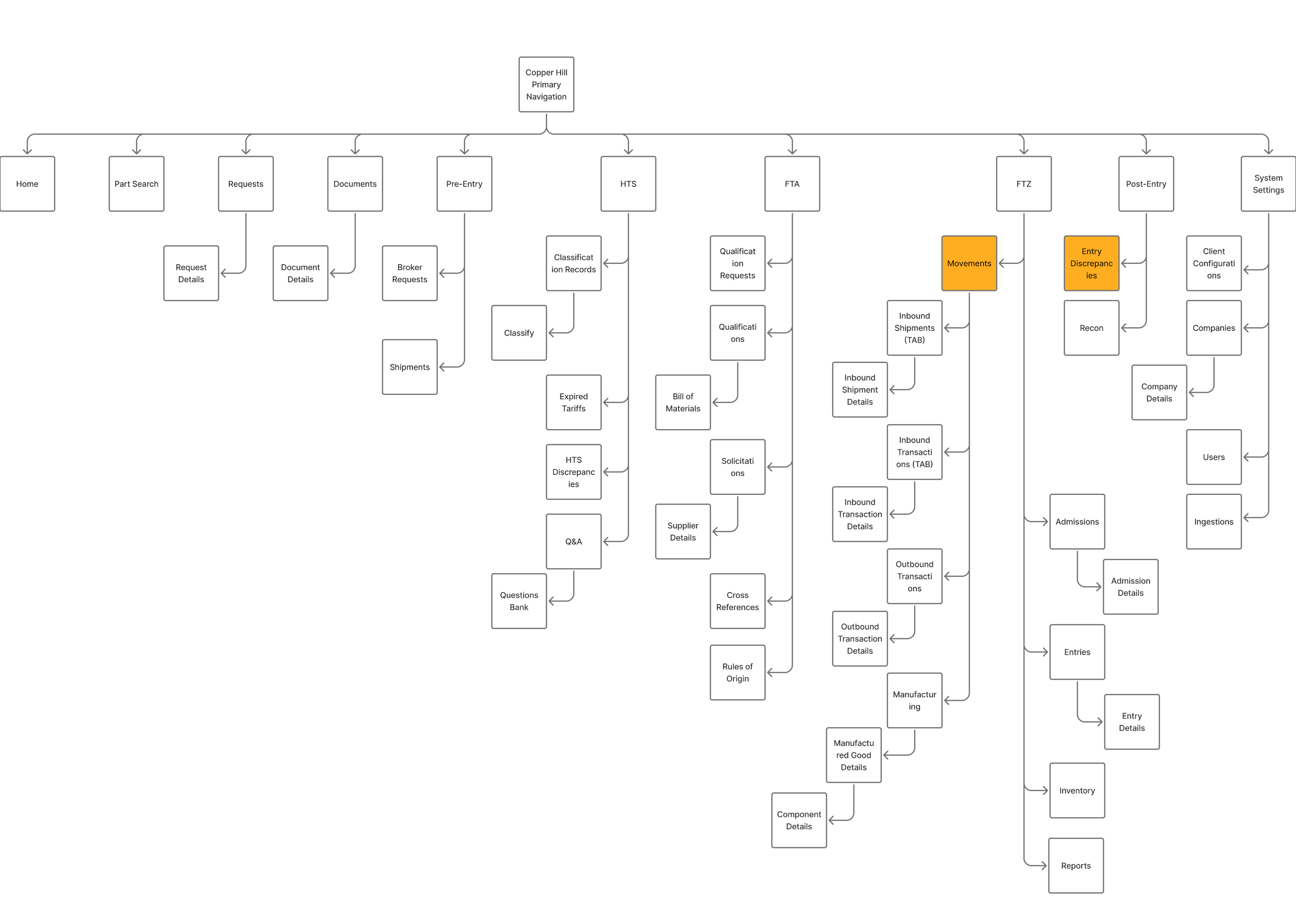
Before diving into the UI, I mapped the "Copperhill Primary Navigation." The platform’s complexity was a double-edged sword: it offered deep functionality (HTS classifications, FTA qualifications, FTZ movements), but its depth was precisely why analysts felt lost. Finding one specific record meant navigating a hierarchy that spanned dozens of sub-pages.
I started by shadowing the Ops team and noticed a broken workflow loop: Analysts would log in → export CSV → open Excel → copy part numbers → email suppliers → wait for replies in Outlook. The platform was glorified file storage.
Core pain points:
- Filters were too rigid to drill down to specific columns, so finding one code among thousands meant exporting everything to Excel
- The platform had no workflow memory—analysts spent 5+ minutes rebuilding the same queries every single morning
- All communication with suppliers happened in scattered email threads with no tracking or search-ability
- Configuring client-specific compliance rules required engineering support, creating bottlenecks during onboarding
Phase 1: Regaining Trust by Fixing the Foundation
If they can't manipulate the data, they won't stay.
My first challenge was realizing that analysts didn't leave the platform because they wanted to; they left because our tables were rigid. They needed the flexibility of Excel within our UI.
I initially attempted to build an Excel-like drag-and-drop resizing feature, but engineering flagged significant performance risks with our large datasets. I pivoted from "pixel-perfect control" to "functional density," designing a preset system (Compact/Standard/Comfortable) that offered the view customization they needed without the lag.
Initial
Revised
To lock in this behavior change, I moved filters to the headers for immediate access and introduced "Saved Views." The result was immediate: the morning ritual of rebuilding queries vanished, and CSV exports dropped by 40%.
View more user flows on Figma!
Phase 2: Closing the Communication Loop
Data visibility was solved, but the workflow was still broken.
Analysts could now find problems, but they had to switch to Outlook to solve them. I needed to bring that communication layer inside the platform.
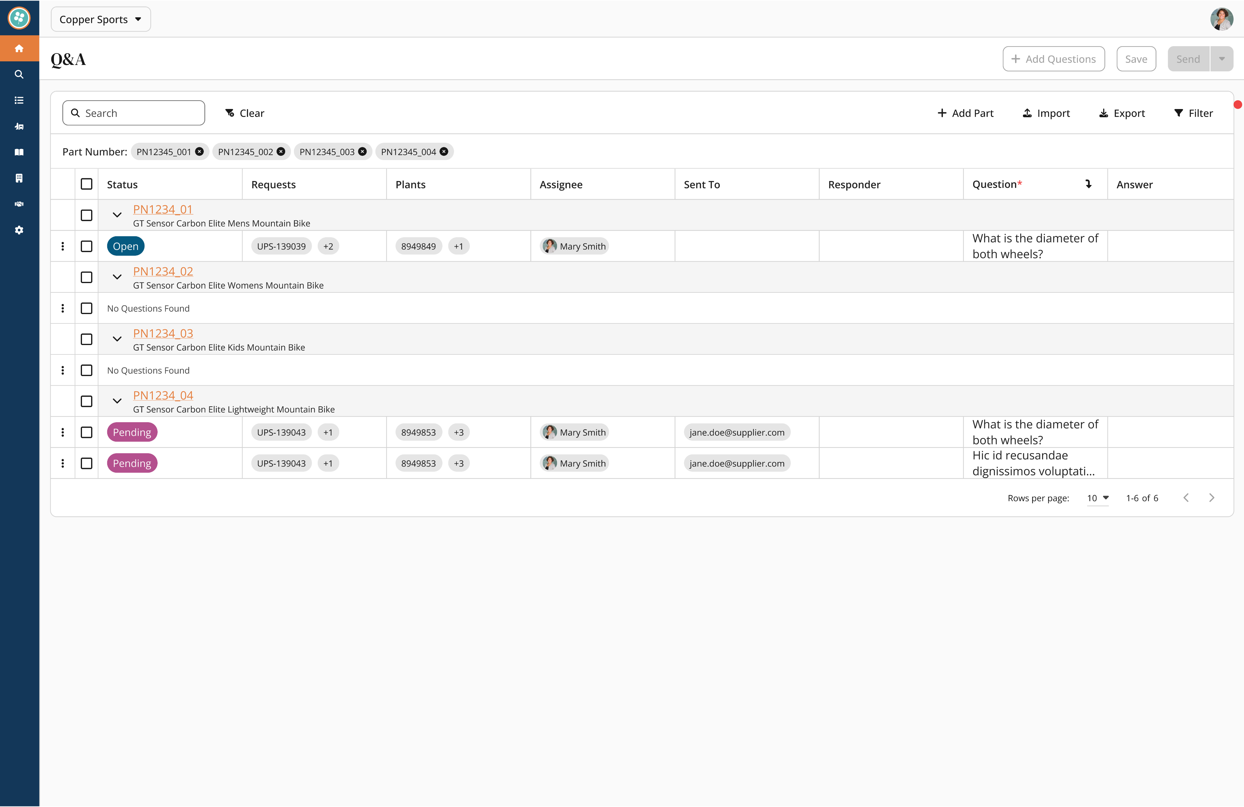
V1: My initial concept grouped questions under expandable parts to keep the table clean.
✅ Good for depth: It kept the main table view unpolluted.
❌ Bad for overview: The data became visually clustered.
❌ Buried Priority: The design didn't prioritize questions, making it hard to see urgent items.
V2: I pivoted to a "flattened" view where every question had its own row to maximize visibility.
✅ Good for scanning: Users could see every issue immediately.
❌ Lost Context: We lost the connection between related questions.
❌ Poor Flow: The placement of the "Status" column interrupted the natural reading flow.
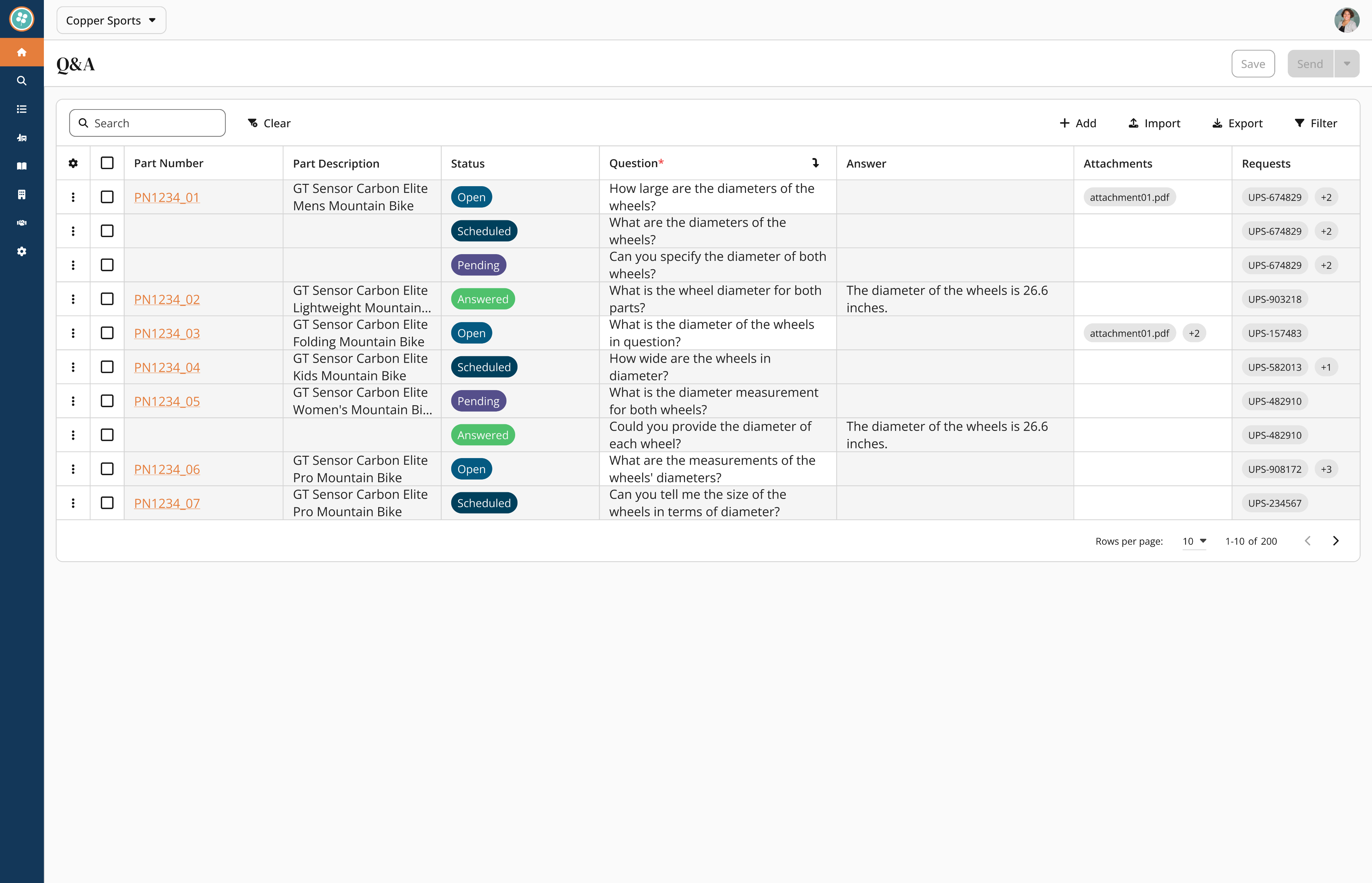
V3: I developed a hybrid model where parts show a "question count" at a glance but expand to show details inline.
✅ Control: Users can perform individual question triage with direct selection controls.
✅ Context: The table allows users to reorder items by part number.
✅ Impact: This design reduced review time by 60% (cutting a typical session from 8 minutes down to 3 minutes).
This animation shows the final Hybrid Layout. Instead of bombarding suppliers with individual emails, the analyst selects multiple questions and uses the Batch Schedule function. This 'draft now, send later' workflow allows them to prep for supplier calls without interruption, reducing overall review time by 60%.
Questions catalog for common queries + Workflow efficiency with question bank
I noticed analysts rewriting the same questions across similar parts. Instead of making them start from scratch every time, I built a searchable library of common questions organized by part type. Questions like "What's the material composition?" became a one-click template instead of a 2-minute typing exercise.
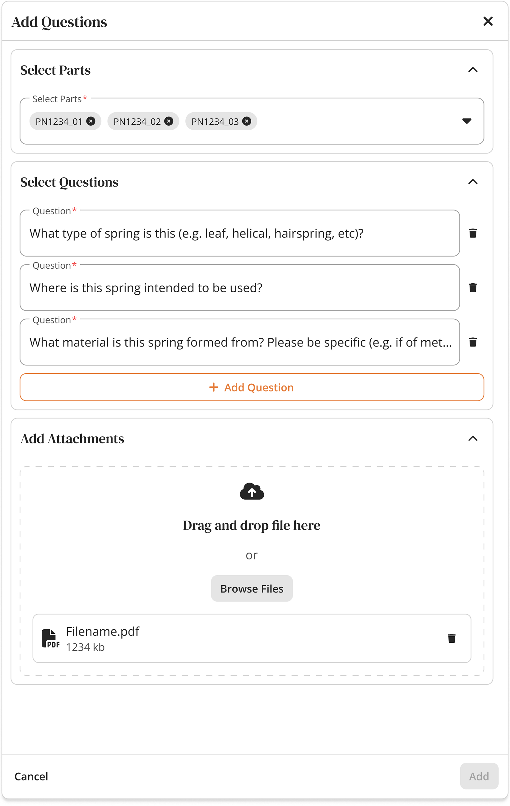
Eliminated manual repetition by introducing a library of one-click, standardized question templates.
Phase 3: Taming the Data Scale
As adoption grew, navigation became the new bottleneck.
With analysts now working fully in the platform, finding specific records became a hunt across five different screens. We needed a Global Search, but our data was messy—a "Shipment" looks nothing like a "Part."
To address these challenges, I asked many questions...What makes each identifier unique? Is shipment number unique across all clients, or just within a client? Can the same part number exist for different companies?
These were all knowledge gaps I had to fill, and I went on with my research.
1
Stakeholder Interviews: I met with FTZ managers and classification experts to identify which data points were critical for quick recognition
2
Defining the MVP: We filtered hundreds of potential data fields down to the "Primary Identifiers" necessary for a MVP.
3
The Challenge: We realized that a "one-size-fits-all" list wouldn't work. A Shipment result needed a timestamp, while a Part result needed a description.
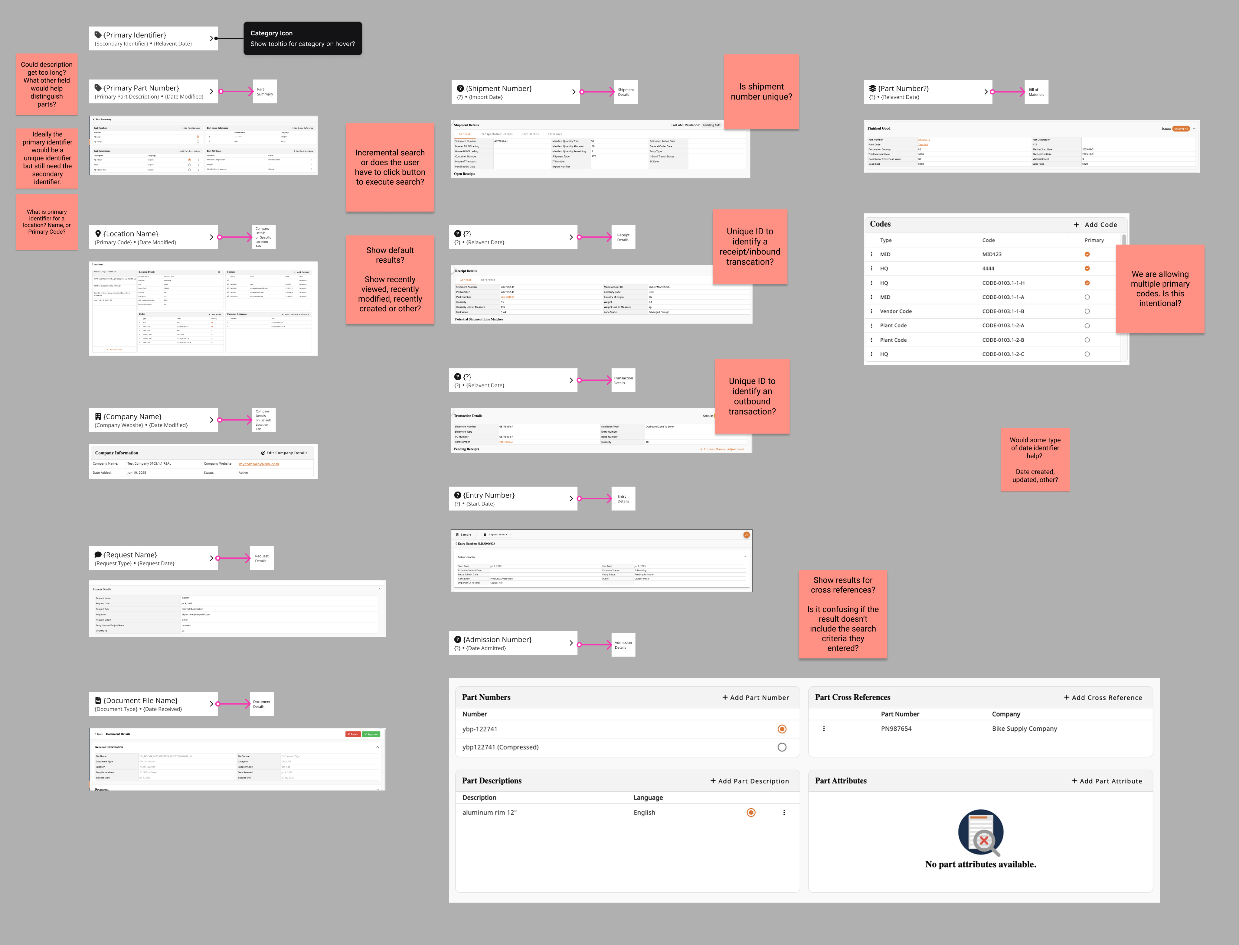
Identifying unique identifiers for each data type was crucial to the backend query structure.
Categorized results by type
After mapping the landscape, I designed entity-specific result cards. Part results show company + description + status. Shipment results show date + location + transaction count. This prevented the "which 1234?" problem where identical numbers meant completely different things.
Result: Eliminated 5+ clicks per lookup, enabled team troubleshooting without 20 questions.
Phase 4: Scaling Logic from "Universal" to "Granular"
As adoption grew, navigation became the new bottleneck.
The platform was working, but setting up client-specific compliance rules still required engineering tickets. I needed to design a self-service mode that was powerful enough for custom rules but safe enough to prevent compliance disasters.
I had already designed and shipped the core Rules of Origin (ROO) workflow. It was a robust system that allowed analysts to link parts to rules and manage compliance tables seamlessly. The "Universal" flow was working perfectly—standardizing compliance across the board.
The foundational design—a smooth, linear flow for setting global compliance rules.
As we onboarded enterprise clients, we hit a wall. Large clients often have unique exceptions that contradict standard rules. The existing system was binary: changing a rule for one client broke it for everyone else. We were back to relying on engineers to hard-code these exceptions.
I evolved the architecture to allow Client Overrides. A new toggle that intercepts the universal rule and applies custom logic.
The enhancement—analysts can now toggle "Client Specific" mode, applying overrides without touching the master code.
Additional Feature: Design System 2.0
Under the Hood: The Engine Behind the Speed
To ship complex features like Polymorphic Search and Client-Specific Rules without creating technical debt, I couldn't just design screens—I had to rebuild the foundation.
I migrated our documentation to Zeroheight and built Design System 2.0, creating a "Single Source of Truth" that synchronized design decisions with code. This reduced UI inconsistencies by ~30% and allowed developers to build "right the first time."
View Design System 2.0 Documentation
Not interested in the pixels? Continue below for the final results and retrospective.
Key Takeaways & Reflection
By introducing Contextual Q&A, Bulk Actions, and Self-Service Rules, we reduced external tool dependency by 40% and cut question review times by 60%. We didn't just improve the UI; we gave analysts hours of their week back.
What did I learn?
Feasibility is a Creative Constraint: The "Resizing Pivot" taught me that technical limitations often lead to better UX. Being forced to abandon "pixel-perfect resizing" led to the "Density Presets," which resulted in a cleaner interface and zero performance lag.
Efficiency is the Ultimate B2B Feature: In consumer apps, "delight" might be a micro-interaction. In B2B, delight is speed. Features like Saved Views and Bulk Actions aren't flashy, but they are the difference between a user tolerating the software and championing it.
Trust is a UX Metric: The adoption of the platform didn't skyrocket just because features were added; it grew because I added Safety Rails (like the Confirm Modals and Visual Tags in Phase 4). Users will only explore powerful tools if they feel safe from making catastrophic mistakes.
What I’d Do Differently
Instrument Metrics Earlier: I relied heavily on qualitative data (shadowing analysts) to validate success. If I were to do this again, I would implement event tracking (like Mixpanel) on Day 1 to capture quantitative baselines for "Time on Task." This would have made proving the ROI of features like "Global Search" even easier.
Integrate Engineers at the "Napkin" Stage: While I collaborated with engineering often, the "Resizing" block could have been avoided entirely if I had brought them in during the low-fidelity sketching phase. In the future, I will host "Tech Feasibility Audits" before moving any pixel in Figma.
Copperhill
Optimizing Enterprise Data Workflows & Reducing Excel Dependency: Redesigning core filtering logic and establishing Design System 2.0 to decrease external data exports by 40%.
Role:
Product Design Intern
Duration:
June 2025 - August 2025
Tools
Figma
Zeroheight
Jira
Overview
Modernizing the Trade Compliance Workflow
Copperhill is an international trade compliance company building an AI-driven platform for global trade management. When I joined, the platform had a "usability gap": Analysts were bypassing the tool entirely—exporting data to Excel, tracking questions in Outlook, and waiting on engineers to configure basic rules.
What clients actually needed: A platform that could handle tens of thousands of classification entries without forcing analysts to export everything to Excel just to do their jobs. They needed speed, flexibility, and the ability to save their work—because in trade compliance, repeating the same 5-minute query setup every morning isn't just annoying, it's a massive productivity killer.
The solution: I designed a unified workspace integrating Advanced Filtering, In-App Q&A, Global Search, and a Configurable Rules Engine.
- 40% reduction in external tool dependency.
- 60% faster question review time.
- Zero engineering time required for client rule setups.
Problem
Every Morning Started with 5 Minutes of Rebuilding Yesterday's Work
Before diving into the UI, I mapped the "Copperhill Primary Navigation." The platform’s complexity was a double-edged sword: it offered deep functionality (HTS classifications, FTA qualifications, FTZ movements), but its depth was precisely why analysts felt lost. Finding one specific record meant navigating a hierarchy that spanned dozens of sub-pages.
I started by shadowing the Ops team and noticed a broken workflow loop: Analysts would log in → export CSV → open Excel → copy part numbers → email suppliers → wait for replies in Outlook. The platform was glorified file storage.
Core pain points:
- Filters were too rigid to drill down to specific columns, so finding one code among thousands meant exporting everything to Excel
- The platform had no workflow memory—analysts spent 5+ minutes rebuilding the same queries every single morning
- All communication with suppliers happened in scattered email threads with no tracking or search-ability
- Configuring client-specific compliance rules required engineering support, creating bottlenecks during onboarding
Phase 1: Regaining Trust by Fixing the Foundation
If they can't manipulate the data, they won't stay.
My first challenge was realizing that analysts didn't leave the platform because they wanted to; they left because our tables were rigid. They needed the flexibility of Excel within our UI.
I initially attempted to build an Excel-like drag-and-drop resizing feature, but engineering flagged significant performance risks with our large datasets. I pivoted from "pixel-perfect control" to "functional density," designing a preset system (Compact/Standard/Comfortable) that offered the view customization they needed without the lag.
Initial
Revised
To lock in this behavior change, I moved filters to the headers for immediate access and introduced "Saved Views." The result was immediate: the morning ritual of rebuilding queries vanished, and CSV exports dropped by 40%.
View more user flows on Figma!
Phase 2: Closing the Communication Loop
Data visibility was solved, but the workflow was still broken.
Analysts could now find problems, but they had to switch to Outlook to solve them. I needed to bring that communication layer inside the platform.
V1: My initial concept grouped questions under expandable parts to keep the table clean.
✅ Good for depth: It kept the main table view unpolluted.
❌ Bad for overview: The data became visually clustered.
❌ Buried Priority: The design didn't prioritize questions, making it hard to see urgent items.
V2: I pivoted to a "flattened" view where every question had its own row to maximize visibility.
✅ Good for scanning: Users could see every issue immediately.
❌ Lost Context: We lost the connection between related questions.
❌ Poor Flow: The placement of the "Status" column interrupted the natural reading flow.
V3: I developed a hybrid model where parts show a "question count" at a glance but expand to show details inline.
✅ Control: Users can perform individual question triage with direct selection controls.
✅ Context: The table allows users to reorder items by part number.
✅ Impact: This design reduced review time by 60% (cutting a typical session from 8 minutes down to 3 minutes).
This animation shows the final Hybrid Layout. Instead of bombarding suppliers with individual emails, the analyst selects multiple questions and uses the Batch Schedule function. This 'draft now, send later' workflow allows them to prep for supplier calls without interruption, reducing overall review time by 60%.
Questions catalog for common queries + Workflow efficiency with question bank
I noticed analysts rewriting the same questions across similar parts. Instead of making them start from scratch every time, I built a searchable library of common questions organized by part type. Questions like "What's the material composition?" became a one-click template instead of a 2-minute typing exercise.
Eliminated manual repetition by introducing a library of one-click, standardized question templates.
Phase 3: Taming the Data Scale
As adoption grew, navigation became the new bottleneck.
With analysts now working fully in the platform, finding specific records became a hunt across five different screens. We needed a Global Search, but our data was messy—a "Shipment" looks nothing like a "Part."
To address these challenges, I asked many questions...What makes each identifier unique? Is shipment number unique across all clients, or just within a client? Can the same part number exist for different companies?
These were all knowledge gaps I had to fill, and I went on with my research.
1
Stakeholder Interviews: I met with FTZ managers and classification experts to identify which data points were critical for quick recognition
2
Defining the MVP: We filtered hundreds of potential data fields down to the "Primary Identifiers" necessary for a MVP.
3
The Challenge: We realized that a "one-size-fits-all" list wouldn't work. A Shipment result needed a timestamp, while a Part result needed a description.
Identifying unique identifiers for each data type was crucial to the backend query structure.
Categorized results by type
After mapping the landscape, I designed entity-specific result cards. Part results show company + description + status. Shipment results show date + location + transaction count. This prevented the "which 1234?" problem where identical numbers meant completely different things.
Result: Eliminated 5+ clicks per lookup, enabled team troubleshooting without 20 questions.
Phase 4: Scaling Logic from "Universal" to "Granular"
As adoption grew, navigation became the new bottleneck.
The platform was working, but setting up client-specific compliance rules still required engineering tickets. I needed to design a self-service mode that was powerful enough for custom rules but safe enough to prevent compliance disasters.
I had already designed and shipped the core Rules of Origin (ROO) workflow. It was a robust system that allowed analysts to link parts to rules and manage compliance tables seamlessly. The "Universal" flow was working perfectly—standardizing compliance across the board.
The foundational design—a smooth, linear flow for setting global compliance rules.
As we onboarded enterprise clients, we hit a wall. Large clients often have unique exceptions that contradict standard rules. The existing system was binary: changing a rule for one client broke it for everyone else. We were back to relying on engineers to hard-code these exceptions.
I evolved the architecture to allow Client Overrides. A new toggle that intercepts the universal rule and applies custom logic.
The enhancement—analysts can now toggle "Client Specific" mode, applying overrides without touching the master code.
Additional Feature: Design System 2.0
Under the Hood: The Engine Behind the Speed
To ship complex features like Polymorphic Search and Client-Specific Rules without creating technical debt, I couldn't just design screens—I had to rebuild the foundation.
I migrated our documentation to Zeroheight and built Design System 2.0, creating a "Single Source of Truth" that synchronized design decisions with code. This reduced UI inconsistencies by ~30% and allowed developers to build "right the first time."
View Design System 2.0 Documentation
Not interested in the pixels? Continue below for the final results and retrospective.
Key Takeaways & Reflection
By introducing Contextual Q&A, Bulk Actions, and Self-Service Rules, we reduced external tool dependency by 40% and cut question review times by 60%. We didn't just improve the UI; we gave analysts hours of their week back.
What did I learn?
Feasibility is a Creative Constraint: The "Resizing Pivot" taught me that technical limitations often lead to better UX. Being forced to abandon "pixel-perfect resizing" led to the "Density Presets," which resulted in a cleaner interface and zero performance lag.
Efficiency is the Ultimate B2B Feature: In consumer apps, "delight" might be a micro-interaction. In B2B, delight is speed. Features like Saved Views and Bulk Actions aren't flashy, but they are the difference between a user tolerating the software and championing it.
Trust is a UX Metric: The adoption of the platform didn't skyrocket just because features were added; it grew because I added Safety Rails (like the Confirm Modals and Visual Tags in Phase 4). Users will only explore powerful tools if they feel safe from making catastrophic mistakes.
What I’d Do Differently
Instrument Metrics Earlier: I relied heavily on qualitative data (shadowing analysts) to validate success. If I were to do this again, I would implement event tracking (like Mixpanel) on Day 1 to capture quantitative baselines for "Time on Task." This would have made proving the ROI of features like "Global Search" even easier.
Integrate Engineers at the "Napkin" Stage: While I collaborated with engineering often, the "Resizing" block could have been avoided entirely if I had brought them in during the low-fidelity sketching phase. In the future, I will host "Tech Feasibility Audits" before moving any pixel in Figma.
Copperhill
Optimizing Enterprise Data Workflows & Reducing Excel Dependency: Redesigning core filtering logic and establishing Design System 2.0 to decrease external data exports by 40%.
Role:
Product Design Intern
Duration:
June 2025 - August 2025
Tools
Figma
Zeroheight
Jira
Overview
Modernizing the Trade Compliance Workflow
Copperhill is an international trade compliance company building an AI-driven platform for global trade management. When I joined, the platform had a "usability gap": Analysts were bypassing the tool entirely—exporting data to Excel, tracking questions in Outlook, and waiting on engineers to configure basic rules.
What clients actually needed: A platform that could handle tens of thousands of classification entries without forcing analysts to export everything to Excel just to do their jobs. They needed speed, flexibility, and the ability to save their work—because in trade compliance, repeating the same 5-minute query setup every morning isn't just annoying, it's a massive productivity killer.
The solution: I designed a unified workspace integrating Advanced Filtering, In-App Q&A, Global Search, and a Configurable Rules Engine.
- 40% reduction in external tool dependency.
- 60% faster question review time.
- Zero engineering time required for client rule setups.
Problem
Every Morning Started with 5 Minutes of Rebuilding Yesterday's Work
Before diving into the UI, I mapped the "Copperhill Primary Navigation." The platform’s complexity was a double-edged sword: it offered deep functionality (HTS classifications, FTA qualifications, FTZ movements), but its depth was precisely why analysts felt lost. Finding one specific record meant navigating a hierarchy that spanned dozens of sub-pages.
I started by shadowing the Ops team and noticed a broken workflow loop: Analysts would log in → export CSV → open Excel → copy part numbers → email suppliers → wait for replies in Outlook. The platform was glorified file storage.
Core pain points:
- Filters were too rigid to drill down to specific columns, so finding one code among thousands meant exporting everything to Excel
- The platform had no workflow memory—analysts spent 5+ minutes rebuilding the same queries every single morning
- All communication with suppliers happened in scattered email threads with no tracking or search-ability
- Configuring client-specific compliance rules required engineering support, creating bottlenecks during onboarding
Phase 1: Regaining Trust by Fixing the Foundation
If they can't manipulate the data, they won't stay.
My first challenge was realizing that analysts didn't leave the platform because they wanted to; they left because our tables were rigid. They needed the flexibility of Excel within our UI.
I initially attempted to build an Excel-like drag-and-drop resizing feature, but engineering flagged significant performance risks with our large datasets. I pivoted from "pixel-perfect control" to "functional density," designing a preset system (Compact/Standard/Comfortable) that offered the view customization they needed without the lag.
Initial
Revised
To lock in this behavior change, I moved filters to the headers for immediate access and introduced "Saved Views." The result was immediate: the morning ritual of rebuilding queries vanished, and CSV exports dropped by 40%.
View more user flows on Figma!
Phase 2: Closing the Communication Loop
Data visibility was solved, but the workflow was still broken.
Analysts could now find problems, but they had to switch to Outlook to solve them. I needed to bring that communication layer inside the platform.
I designed a Q&A workflow directly into the data tables, but getting the interaction cost right took three critical iterations: grouping questions under expandable parts (good for depth, bad for overview), flattening to one question per row (good for scanning, lost the connection between related questions), and finally a hybrid where parts show question count at a glance but expand to show details inline. This reduced review time by 60% (8 minutes to 3 minutes) and made supplier call prep significantly easier.
V1: My initial concept grouped questions under expandable parts to keep the table clean.
✅ Good for depth: It kept the main table view unpolluted.
❌ Bad for overview: The data became visually clustered.
❌ Buried Priority: The design didn't prioritize questions, making it hard to see urgent items.
V2: I pivoted to a "flattened" view where every question had its own row to maximize visibility.
✅ Good for scanning: Users could see every issue immediately.
❌ Lost Context: We lost the connection between related questions.
❌ Poor Flow: The placement of the "Status" column interrupted the natural reading flow.
V3: I developed a hybrid model where parts show a "question count" at a glance but expand to show details inline.
✅ Control: Users can perform individual question triage with direct selection controls.
✅ Context: The table allows users to reorder items by part number.
✅ Impact: This design reduced review time by 60% (cutting a typical session from 8 minutes down to 3 minutes).
This animation shows the final Hybrid Layout. Instead of bombarding suppliers with individual emails, the analyst selects multiple questions and uses the Batch Schedule function. This 'draft now, send later' workflow allows them to prep for supplier calls without interruption, reducing overall review time by 60%.
Questions catalog for common queries + Workflow efficiency with question bank
I noticed analysts rewriting the same questions across similar parts. Instead of making them start from scratch every time, I built a searchable library of common questions organized by part type. Questions like "What's the material composition?" became a one-click template instead of a 2-minute typing exercise.
Eliminated manual repetition by introducing a library of one-click, standardized question templates.
Phase 3: Taming the Data Scale
As adoption grew, navigation became the new bottleneck.
With analysts now working fully in the platform, finding specific records became a hunt across five different screens. We needed a Global Search, but our data was messy—a "Shipment" looks nothing like a "Part."
To address these challenges, I asked many questions...What makes each identifier unique? Is shipment number unique across all clients, or just within a client? Can the same part number exist for different companies?
These were all knowledge gaps I had to fill, and I went on with my research.
1
Stakeholder Interviews: I met with FTZ managers and classification experts to identify which data points were critical for quick recognition
2
Defining the MVP: We filtered hundreds of potential data fields down to the "Primary Identifiers" necessary for a MVP.
3
The Challenge: We realized that a "one-size-fits-all" list wouldn't work. A Shipment result needed a timestamp, while a Part result needed a description.
Identifying unique identifiers for each data type was crucial to the backend query structure.
Categorized results by type
After mapping the landscape, I designed entity-specific result cards. Part results show company + description + status. Shipment results show date + location + transaction count. This prevented the "which 1234?" problem where identical numbers meant completely different things.
Result: Eliminated 5+ clicks per lookup, enabled team troubleshooting without 20 questions.
Phase 4: Scaling Logic from "Universal" to "Granular"
As adoption grew, navigation became the new bottleneck.
The platform was working, but setting up client-specific compliance rules still required engineering tickets. I needed to design a self-service mode that was powerful enough for custom rules but safe enough to prevent compliance disasters.
I had already designed and shipped the core Rules of Origin (ROO) workflow. It was a robust system that allowed analysts to link parts to rules and manage compliance tables seamlessly. The "Universal" flow was working perfectly—standardizing compliance across the board.
The foundational design—a smooth, linear flow for setting global compliance rules.
As we onboarded enterprise clients, we hit a wall. Large clients often have unique exceptions that contradict standard rules. The existing system was binary: changing a rule for one client broke it for everyone else. We were back to relying on engineers to hard-code these exceptions.
I evolved the architecture to allow Client Overrides. A new toggle that intercepts the universal rule and applies custom logic.
The enhancement—analysts can now toggle "Client Specific" mode, applying overrides without touching the master code.
Additional Feature: Design System 2.0
Under the Hood: The Engine Behind the Speed
To ship complex features like Polymorphic Search and Client-Specific Rules without creating technical debt, I couldn't just design screens—I had to rebuild the foundation.
I migrated our documentation to Zeroheight and built Design System 2.0, creating a "Single Source of Truth" that synchronized design decisions with code. This reduced UI inconsistencies by ~30% and allowed developers to build "right the first time."
View Design System 2.0 Documentation
Not interested in the pixels? Continue below for the final results and retrospective.
Key Takeaways & Reflection
By introducing Contextual Q&A, Bulk Actions, and Self-Service Rules, we reduced external tool dependency by 40% and cut question review times by 60%. We didn't just improve the UI; we gave analysts hours of their week back.
What did I learn?
Feasibility is a Creative Constraint: The "Resizing Pivot" taught me that technical limitations often lead to better UX. Being forced to abandon "pixel-perfect resizing" led to the "Density Presets," which resulted in a cleaner interface and zero performance lag.
Efficiency is the Ultimate B2B Feature: In consumer apps, "delight" might be a micro-interaction. In B2B, delight is speed. Features like Saved Views and Bulk Actions aren't flashy, but they are the difference between a user tolerating the software and championing it.
Trust is a UX Metric: The adoption of the platform didn't skyrocket just because features were added; it grew because I added Safety Rails (like the Confirm Modals and Visual Tags in Phase 4). Users will only explore powerful tools if they feel safe from making catastrophic mistakes.
What I’d Do Differently
Instrument Metrics Earlier: I relied heavily on qualitative data (shadowing analysts) to validate success. If I were to do this again, I would implement event tracking (like Mixpanel) on Day 1 to capture quantitative baselines for "Time on Task." This would have made proving the ROI of features like "Global Search" even easier.
Integrate Engineers at the "Napkin" Stage: While I collaborated with engineering often, the "Resizing" block could have been avoided entirely if I had brought them in during the low-fidelity sketching phase. In the future, I will host "Tech Feasibility Audits" before moving any pixel in Figma.